As fascinating as it would be to actually have a polar bear in my artist studio to paint "live" from, I realize the "live" part probably wouldn't apply to one of us for long.
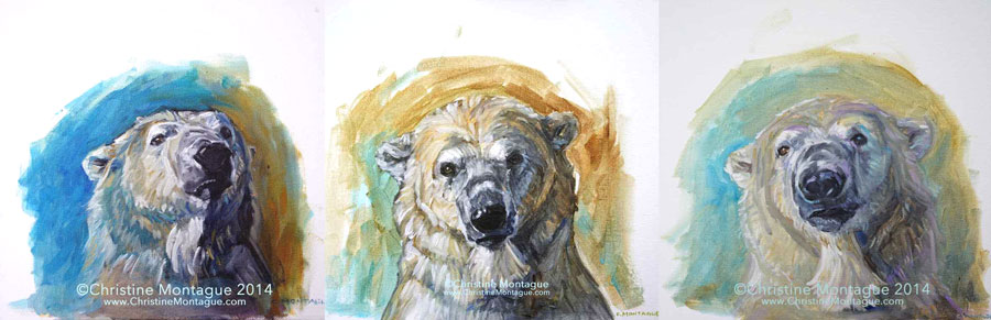
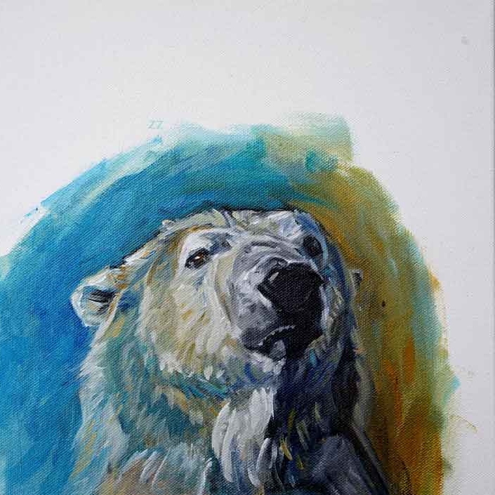
Polar bear portrait study 1. ©Christine Montague. Polar bear oil paintings on canvas. 12" x 12". Contact Christine here.
So to simulate this experience I brought up one of my photos of the wonderful Inukshuk (the adult male bear at the Toronto Zoo) on my laptop. I positioned my laptop at a distance and height a human model would sit in front of the easel. Imagining the model before me was 3D, I blocked in the shapes, values and colours I observed on the blank canvas. There was nothing drawn up before hand.
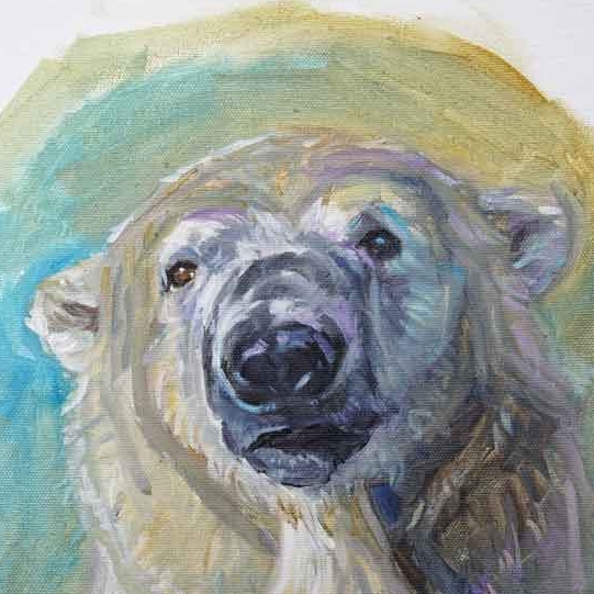
Detail: Polar Bear Portrait 2. (private collection). ©Christine Montague 12" x 12" polar bear oil painting. Please feel free to comment below or comments & inquiries are always welcome here.
In this style of painting, the background is more than a backdrop of colour to hide the white canvas. The paint helps carve out and define the outer edge of the head, helping it to stand out from the canvas. Only at the end of the portrait painting are the fine details, and pure blacks and whites added.
Of course, for me, whether the portrait subject is human or otherwise, the big reward is always when I get to finish the eyes. Thanks to the magic of oils, the polar bear eyes in these portrait paintings, as well as in my imagination, are very much alive.
Polar Bear Portrait Study 3. ©Christine Montague (Please note that this image is slightly cropped. ) . For comments and questions about any of my art please contact me.